The value of your customer insights is rising. Every person at your company needs clear, digestible insights to make their best decisions—in real-time.
Last November we decided to level-up our platform’s visual interface. After innumerable hours of research and development, the Indicative team is proud to announce the launch of a brighter, cleaner, and simpler interface.
Here’s how our enhanced platform can help you:
Visualize more: capture insights faster 🔥
Get a clearer, more impactful, and more direct lens into your customer journeys.
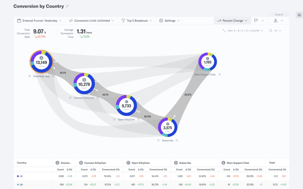
- A simplified query builder helps you generate insights faster
- Interactive funnel visualizations bring your queries to life
- More customization options, to help you drill deep on trends
- Heatmap visualizations make cohorts easier to analyze
Query intuitively: click less, do more, save time 🤔
Don’t waste time dragging and dropping—ask questions, instead.
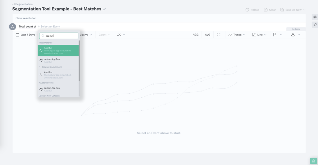
- Achieve faster results in fewer clicks
- Build queries more intuitively, without dragging and dropping elements
- Get “best match” search results on event and property data to create queries faster
- Easily access your Data Dictionary and Properties Explorer to better explore and understand your data
- Navigate tools and saved analysis at the top of your screen
Collaborate better: build company-wide stories 🙌
Organize information into views that everyone at the company can use—no matter what team they’re on or where they’re located.
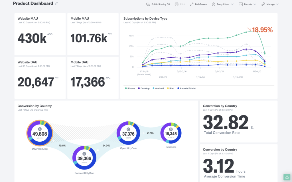
- Upgraded data management makes it easier to organize your team’s data, manage user segments, and schedule reports
- See a project’s activity feed so everyone can work together on collecting insights
- Manage user account permissions, projects, roles, teammates, and billing from one place
- Share, view, and monitor insights on the go, from a user-friendly interface
- Highlight key insights and add context to your analyses through text widgets
- Organize widgets with ease, by dragging and dropping them into place
…Last but not least, we cleaned up our code so that everything runs better, for faster development moving forward. Next up, we’ll be creating more self-serve options on the technical front, so stay tuned. Everything just gets better from here. 💎
Free up valuable mindshare at your company. Share a single source of truth. Collaborate better, and trust your decisions. Indicative is here to help. Learn how we can help you.
Here are the details:
Create a free account now and follow along discovering the specifics below:
Streamlined Navigation
Navigation can be found at the top of the app to free up more space to focus on what’s important – data analysis. This includes a new section called “Views” that contains both your saved Bookmarks and Dashboards.
Indicative On the Go
Indicative is now mobile friendly! You can view any dashboard or analysis directly from your mobile device. Simply open app.indicative.com, or an existing link to visit your analysis on the go.
Enhanced Query Building Capabilities
To maximize space, Properties Explorer and a new Data Dictionary are now available as pullouts to the right of the query builder. We also added a new “Best Match” search when selecting your data for analysis, eliminating the need to scroll from a large list looking for just that one Event or Property.
Dashboard Enhancements
Improved dashboard editing allows you to easily organize your dashboard by dragging and dropping your widgets into place. While on the topic of widgets, you can now also add context to your analysis using Text Widgets.
Segmentation Enhancements
Now you can get more granular with your date settings. Exclude recent empty or partial intervals from your Segmentation analysis.
Funnel Enhancements
Introducing the Conversion Precision setting, featuring Sequential and Approximate mode. Require conversion to occur sequentially with Sequential mode or loosen the restrictions by allowing conversion to occur within the same second in Approximate mode.
Cohort Enhancements
We added a heatmap visualization to the Cohort analysis. This makes your data visualization more digestible, and easier to understand at first glance. We also added the ability to toggle between displaying Complete or Incomplete Cohorts. With Incomplete Cohorts mode, cohort data cells where cohorts have not had time to fully mature will be excluded from your visualization.
Events and Properties Management
We’ve upgraded data management to enable better filtering and organization of all your Events, Properties, User Segments, and Scheduled Reports. You can now Archive or Delete your data, in bulk, and create Custom Events using “or” filters.
Consolidated User and Account Settings
Today you can manage your account, billing, projects, and teammate roles all from one place – your profile view in the upper right-hand corner of your screen.
We’d love to hear your feedback.
