If you feel like you blinked and summer was over, you’re not alone. So much happened. If you’re recently back from a few weeks or a few days of rest, welcome back. In case you missed it, here are the things we’ve been working on since our last update in August. We’ve got a lot of updates so read to the end.
User Activity Timeline: A New Way to Visualize Event History
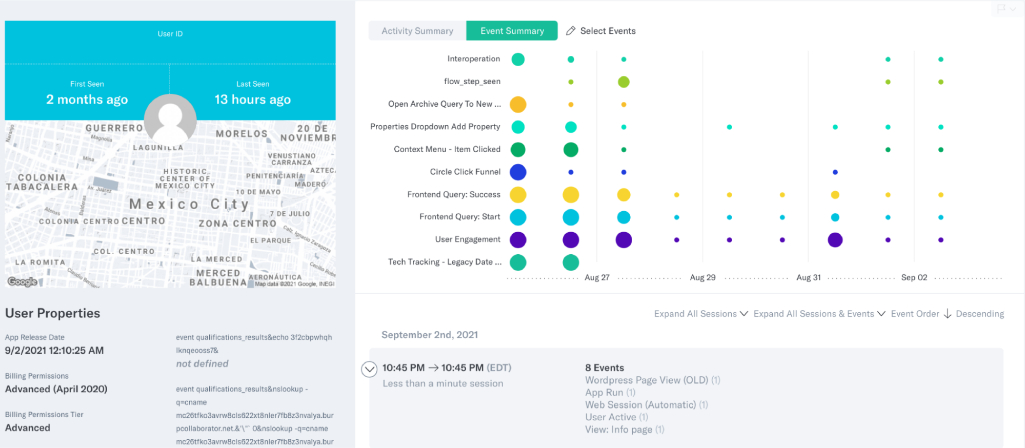
Ever looked at a user’s timeline and wanted to get a quick snapshot of their event and activity history? Now you can. We’ve introduced a new way to visualize your user’s event history and a summary of activity volume by day.
When looking at a specific user, you have the option to visualize their activity on a per event basis. This option will give you a per event timeline of the top 5 events in a user’s history. Each dot represents an event occurrence, and the size of the dot represents the frequency of occurrence during that time frame. You can also choose which events will specifically show up on the timeline. Just like any other query, it’s easy to share the graphic with other Indicative users. In the future, you’ll also be able to save it to a dashboard.
Define Your Data
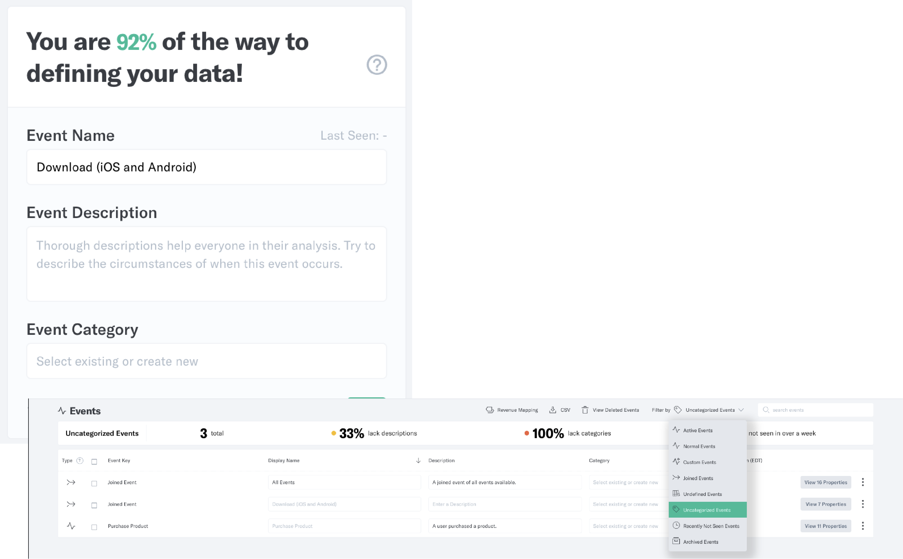
Many users of Indicative aren’t intimately familiar with their data model. So, we’ve introduced a widget on the “My Hub” page that displays the progress your admins have made on defining data on the events and properties page. It should serve as encouragement, and a gentle reminder, for your team admins to define the data model as they use Indicative.
New and Improved Tutorials
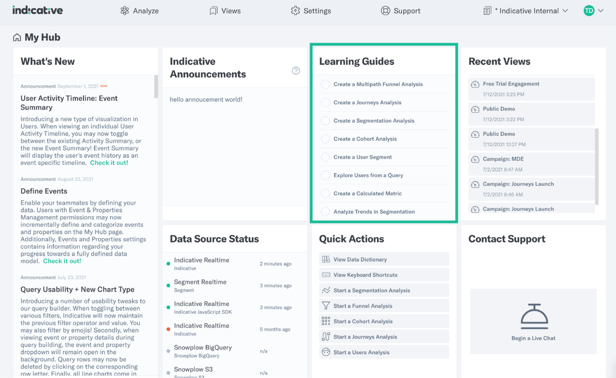
In August, we rolled out an entirely new experience of our interactive tutorials, or Learning Guides. Go to “My Hub” and click on a tutorial in the Learning Guides section to get a walkthrough of any feature in the Indicative platform. In addition to exploring how to create a Multipath Funnel Analysis or Cohort Analysis, you can also explore users from a query, create a calculated metric, or analyze trends in Segmentation.
Snowflake Customers May Now Set Custom Users
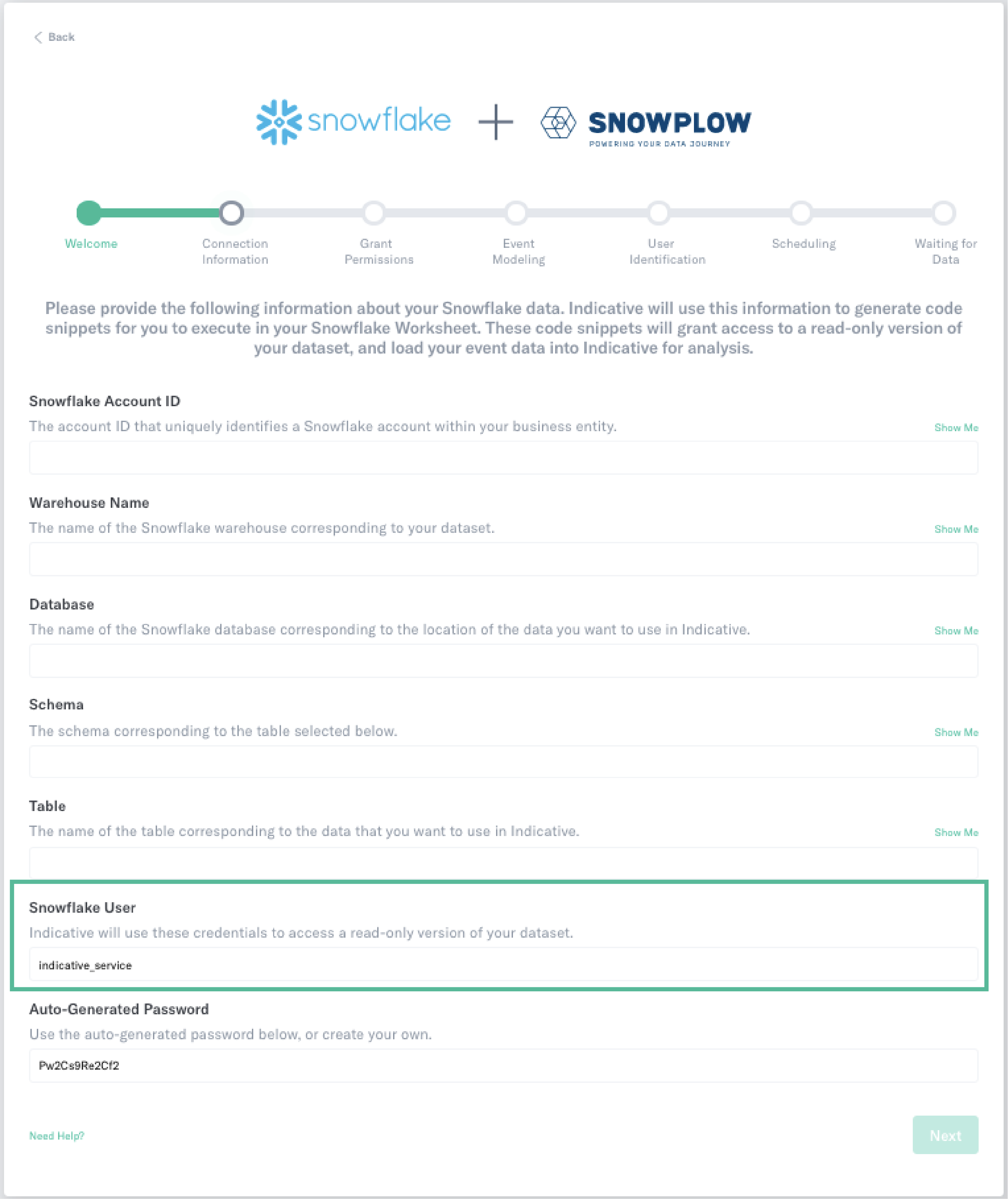
Good news for Snowflake customers. When setting up a Snowflake integration, you can now create your own custom service account (or user) rather than use the Indicative predefined service account. If you are one of our customers who have specific security requirements or naming conventions, this makes sure your set-up is within compliance of your company requirements. Sometimes big deals come in small packages.
Other Improvements
As always, lots of small improvements and bug fixes to make your job easier:
- Create a new dashboard when saving a query widget
- In Event Settings, if the Last Seen timestamp for an event is longer than a week ago, it will turn red (it was previously one day)
- Journeys event spacing and tooltip improvements (more verbose, and bolding)
- Improved widget duplication UX
- Additional quick actions added (Journeys, Project Settings & Tracking)
- Cohort intervals no longer dependent on time generation selection
