All data strategies start with excitement. This is the dominant emotion during kick-off calls with my clients and it can feel amazing. You’ll finally know exactly what is going on inside your product and what growth levers you should be pulling.
This excitement can dissipate as teams find themselves stuck with data they don’t trust, tools they don’t know how to use and overwhelm with the sheer volume of their data. This is where the best companies double-down and focus on solving the psychological challenges behind any data strategy.
In this blog post, I will help you understand and tackle 3 pervasive data issues:
- Poor data literacy
- Lack of trust in data
- Data overwhelm
Any of these issues can derail a strategy and your initial excitement.
Can Your Company Afford Poor Data Literacy?
Data literacy is the ability of your team to understand what your data actually means. It encompasses KPIs, reports, dashboards, and anything related to data.
Imagine what would happen if you didn’t send your children to school for a few months or even a couple of years. They would be behind in all of their work and would consistently miss deadlines.
This lack of education would severely limit their options in the future. The same thing can happen to companies when it comes to data literacy. Poor data literacy is the result of a lack of education within your company.
Maybe this happened because your company has been on a significant growth trajectory and nobody had any time to go through the necessary training. Maybe you didn’t know how to best design these training programs.
This is the perfect time to improve the data literacy at your company by focusing on 4 things: KPIs, data definitions, formulas, exceptions.
KPIs: establish clear rules for what your KPIs mean at your company. There should be no confusion when someone starts talking about LTV or CAC.
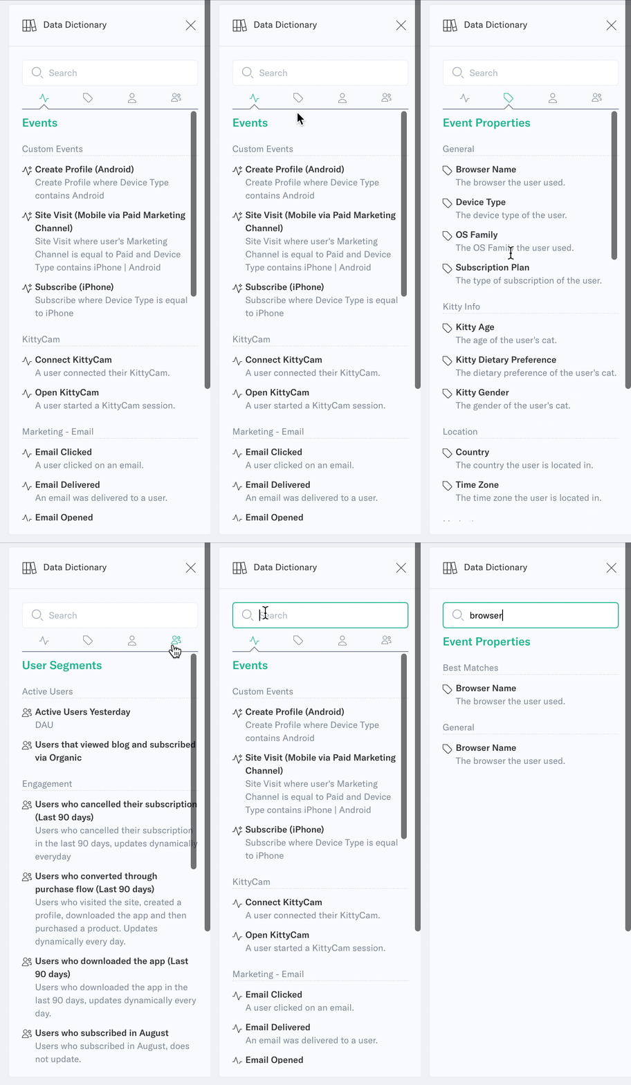
Data Definitions: all critical events and data points in your company should have brief descriptions attached to them. An event like “sign up” should be crystal clear to anyone who reads its definition.
Formulas: major reports and dashboard should contain short explanations for important formulas and calculations. If someone is referring to “active users”, everyone should know what this formula includes.
Exceptions: data is never perfect which leads to exceptions to reports and KPIs. Someone might say “this report looks at sign-ups over the last 30 days except for mobile apps because we don’t have tracking there yet”. These exceptions should be added as annotations or notes to reports.

You can also lean on your analytics tools to maintain these data literacy concepts. Analytics tools like Indicative offer intuitive ways to highlight your data dictionary and to make notes, or annotations on reports. Don’t complicate this. All these notes should be as close to the data source as possible to minimize the friction of users actually consuming them.
How a Lack of Trust Undermines Data Strategies
Sophocles, the Greek playwright, said that “trust dies but mistrust blossoms”. Having trust in your data is an intangible that you will only notice once it is gone. However, we can work to ensure that this trust grows over time.
If you have ever come across a number that you don’t trust, then you have experienced what I call “Funky Data”. This is where there is something “funky” going on with the data but you can’t quite tell what that is.

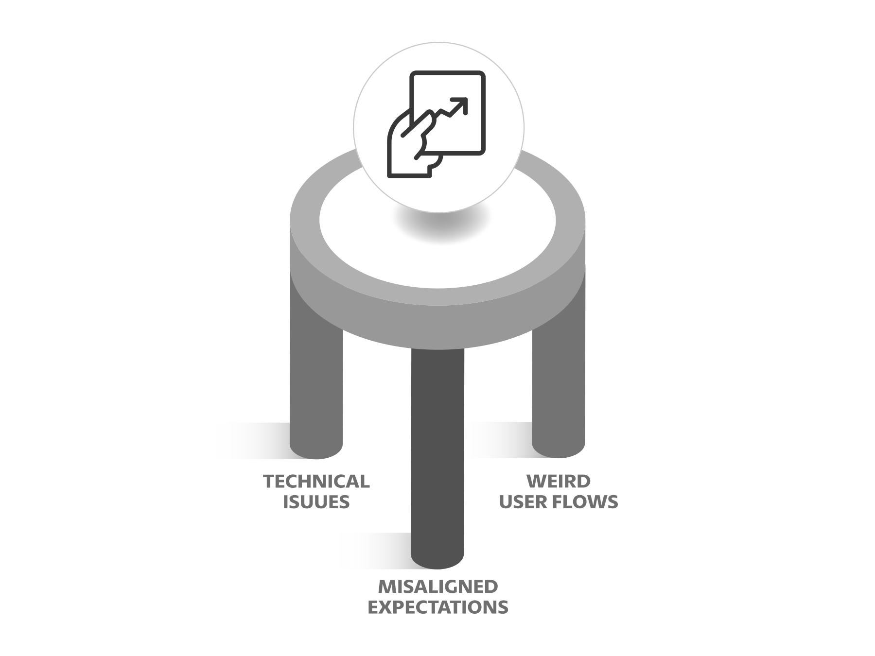
There are 3 scenarios where Funky Data takes places:
Technical Issues
This is what people first think when they see a number that seems wrong. There was an issue in the tracking and this is why the conversion rate for this campaign is lower than expected. Technical issues need to be debugged and fixed but they aren’t the only reason why Funky Data happens.
Misaligned Expectations
This is when there was an expectation around a specific number but the reasoning behind this expectation isn’t strong. Teams were functioning under the expectation that their sign up rate was 10% but they arrived at this number through napkin math 6 months ago. They are now seeing real data and the conversion rate is only 5%. Misaligned expectations need to be reset through empathetic explanations.
Unexpected Calculations
This is when reports and dashboards contain exceptions that you aren’t aware of. You’re expecting to see 25,000 signups but you didn’t know that there’s no tracking for mobile apps yet. This isn’t a technical issue since mobile tracking simply hasn’t been implemented yet. Unexpected calculations need to be debugged to surface the exceptions.
Once again, your software tools can help do some of the heavy lifting. If you have a data warehouse as your source of truth, your analytics platform should easily connect to it, as Indicative does. This reduces the need to match different sources of data for accuracy.
It’s important to remember that 2 out the 3 reasons for Funky Data are due to psychological or expectation issues. That is, there isn’t anything technically wrong with the data but our perception of it is incorrect.
Stop Consuming Data from a Broken Fire Hydrant
Data collection today is easy. Simply add a few lines of code to your website or app and you’ll be drowning in data points. How useful those data points actually are is another question. This ease of collection leads to data overwhelm. If everything is important, then nothing is important.
Let’s run through a mental exercise. How many reports and KPIs are you (or your team) using at any given moment?
If you’re like my best clients, the answer is 3 – 5. Your team and company might have 20 – 30 KPIs, but individuals and teams only use a small portion of them at a time. Even if you cycle through 10 – 15 reports over a year, you’re not using them all at once.
The goal with analytics is to sort through all the data to unlock insights and make better decisions. Trying to consume all the data possible can be detrimental to this goal and prevent you from actually getting to the end goal (better decisions).
You cut down on data overwhelm through 3 strategies:
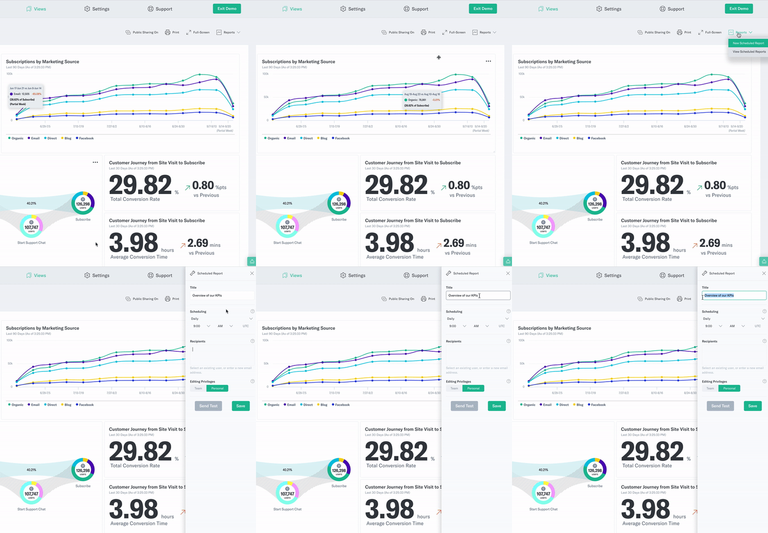
- Digests: digests are a way to get an overview or summary of your relevant data. This could happen on a daily or weekly basis and is focused on showing what changed since the last report. With Indicative, this feature is already built-in using their widely-popular Scheduled Reports.

- Notifications: notifications can be used to alert you of unusual activity such as spikes or drops. They can be used to catch technical tracking issues or opportunities like being mentioned in the press.
- Compromises: compromises are the hard choices you’ll need to make on a regular basis. There’s only so many campaigns and initiatives that you can launch but it’s better to do 3 things by a mile than 10 things by an inch.
Indicative can help you with your data overwhelm through 3 specific features: scheduled reporting, bookmarks, and data exports. You can design the queries that you care about, save them, and come back to them on a regular basis.
Conclusion
Collecting data is a big win but don’t forget about the insights and how people will actually use it. You can take advantage of technology to solve the 3 main challenges we talked about today: poor data literacy, lack of trust and data overwhelm.
Change your focus from how much data you can collect to how many actionable insights your team can generate.
About Ruben Ugarte
Ruben Ugarte is a Data Strategist at Practico Analytics that helps every person in your team use data to make higher quality decisions to lower acquisition costs, save hundreds of thousands of dollars, and reclaim wasted time. He has done this with technology companies across 5 continents across all company stages.


